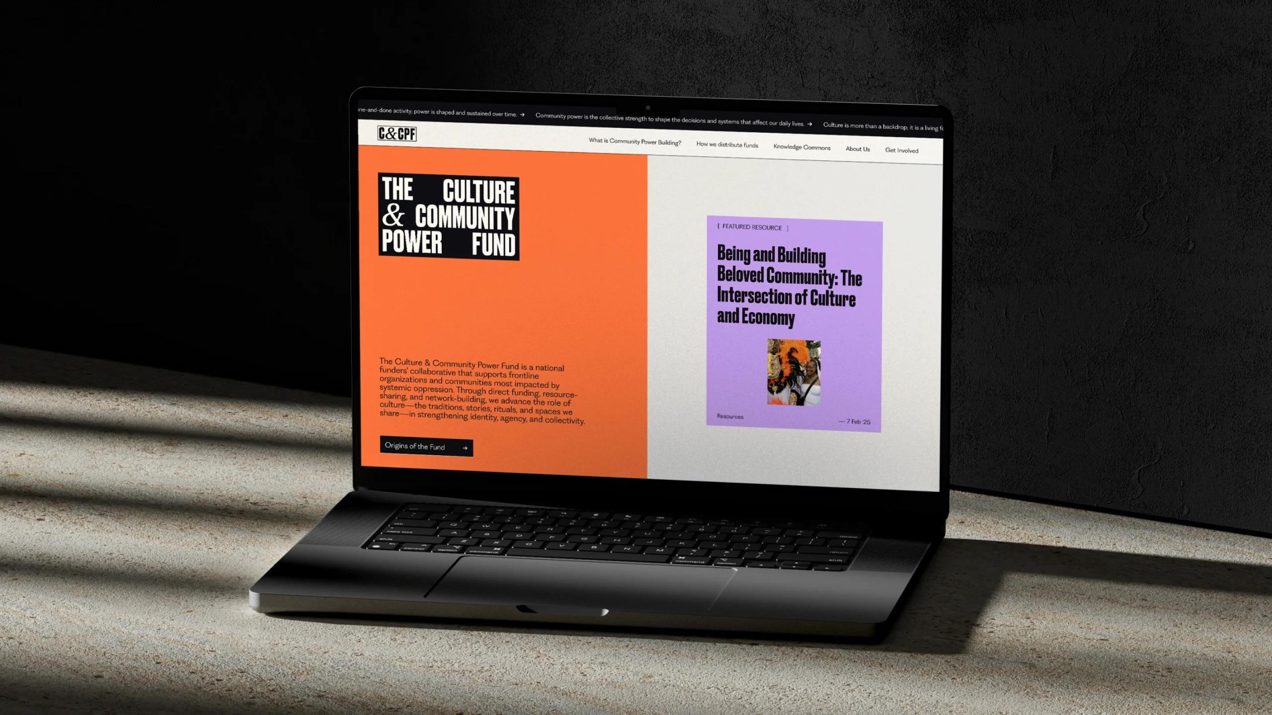
Loading

    Skip to content

    C&CPF

    The Culture & Community Power Fund is a U.S. funders’ collaborative that supports organizations in communities most impacted by systemic oppression.

    Brand Identity | Copywriting | UX + UI | Back-end | Front-end
    The orange, lilac, and white homepage of the Culture & Community Power Fund on a laptop
    The orange, lilac, and white homepage of the Culture & Community Power Fund on a laptop

    Why this matters

    Communities are shaped by a web of intersecting forces. These range from local political decisions—how taxpayer money will be used to fund infrastructure, for example—to broader systems that dictate the distribution of wealth, housing, healthcare, and education.

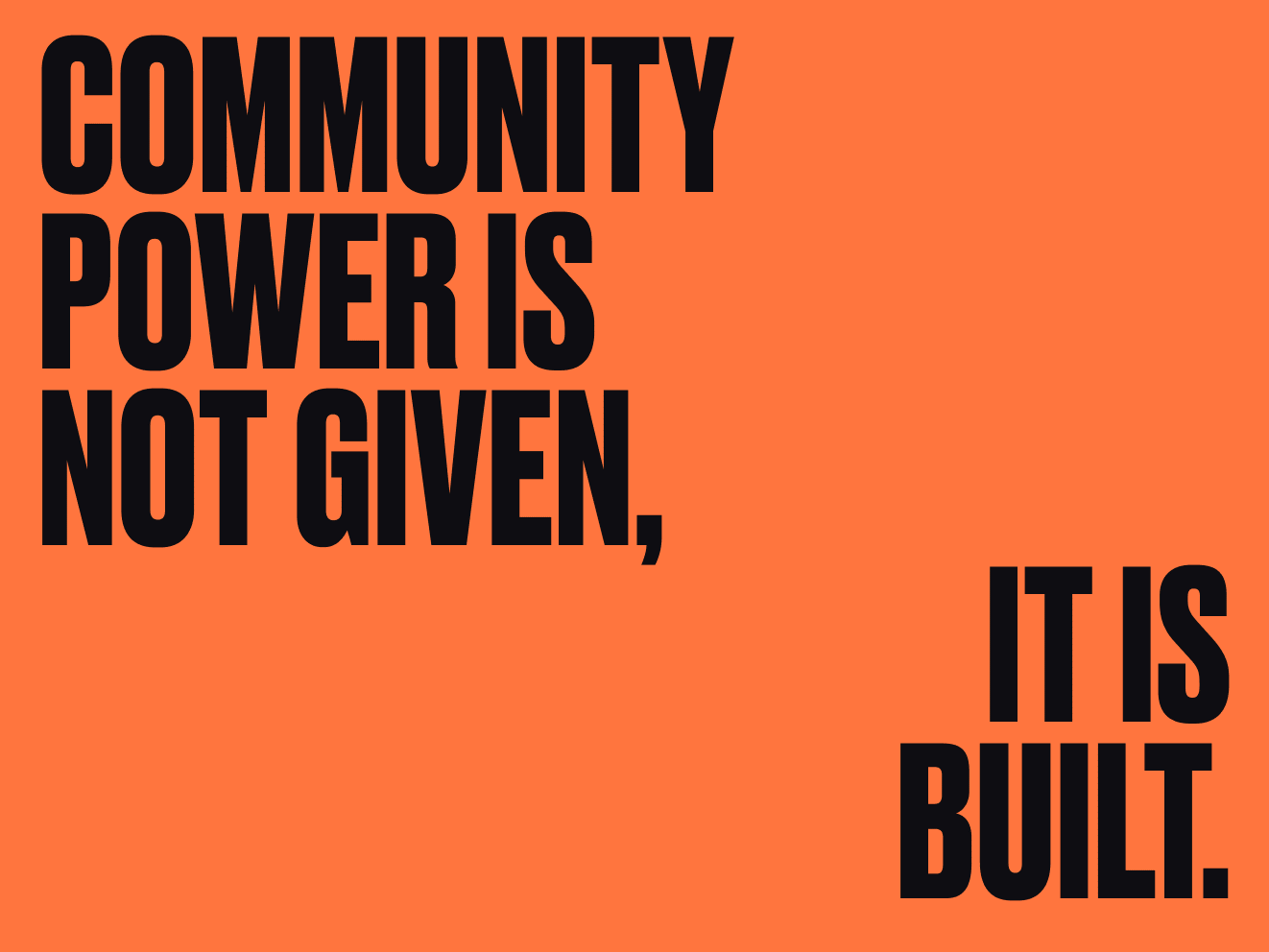
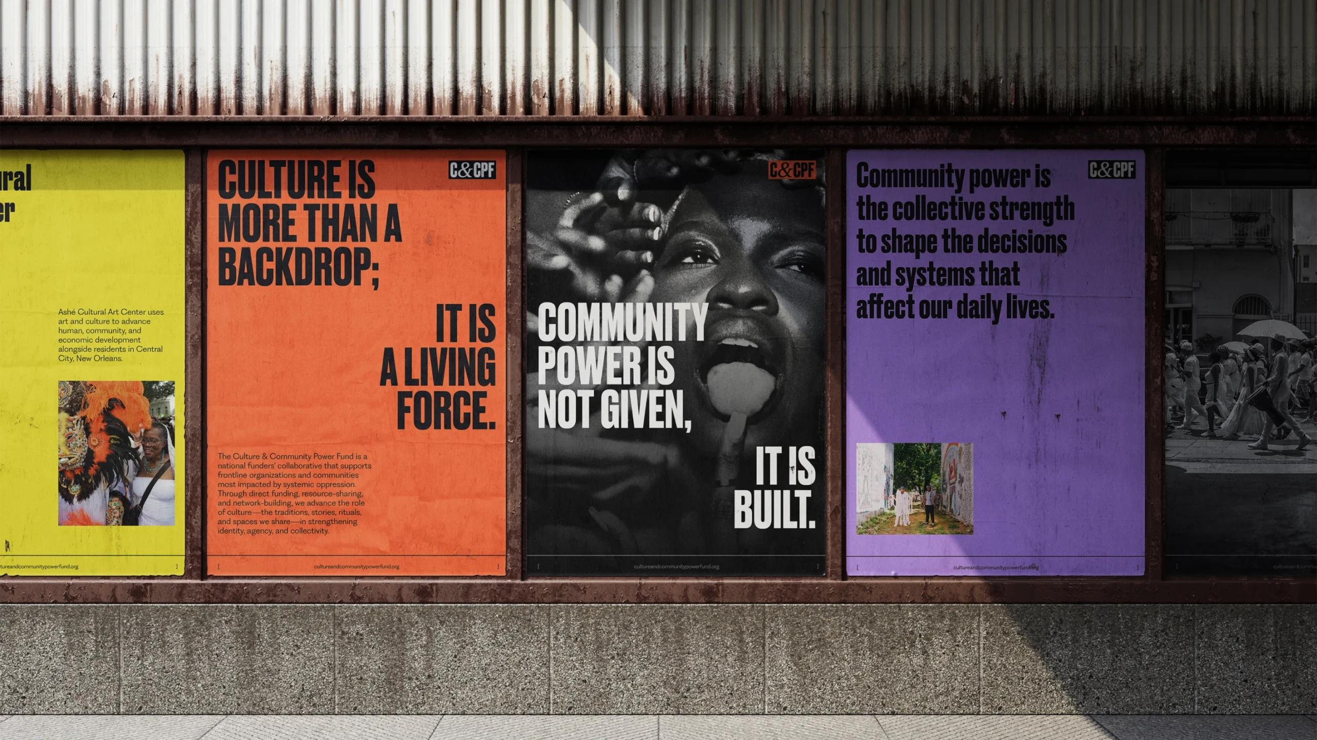
    Building community power means creating pathways for people—not the one percent—to shape the decisions and systems that affect their daily lives.

    The challenge

    Grassroots organizations have been practicing power building in their communities for years. The goal of this site was to create a centralized place for these practitioners’ experiences, wisdom, and challenges, and to show how important culture—the traditions, stories, rituals, and spaces we share—is to that work.
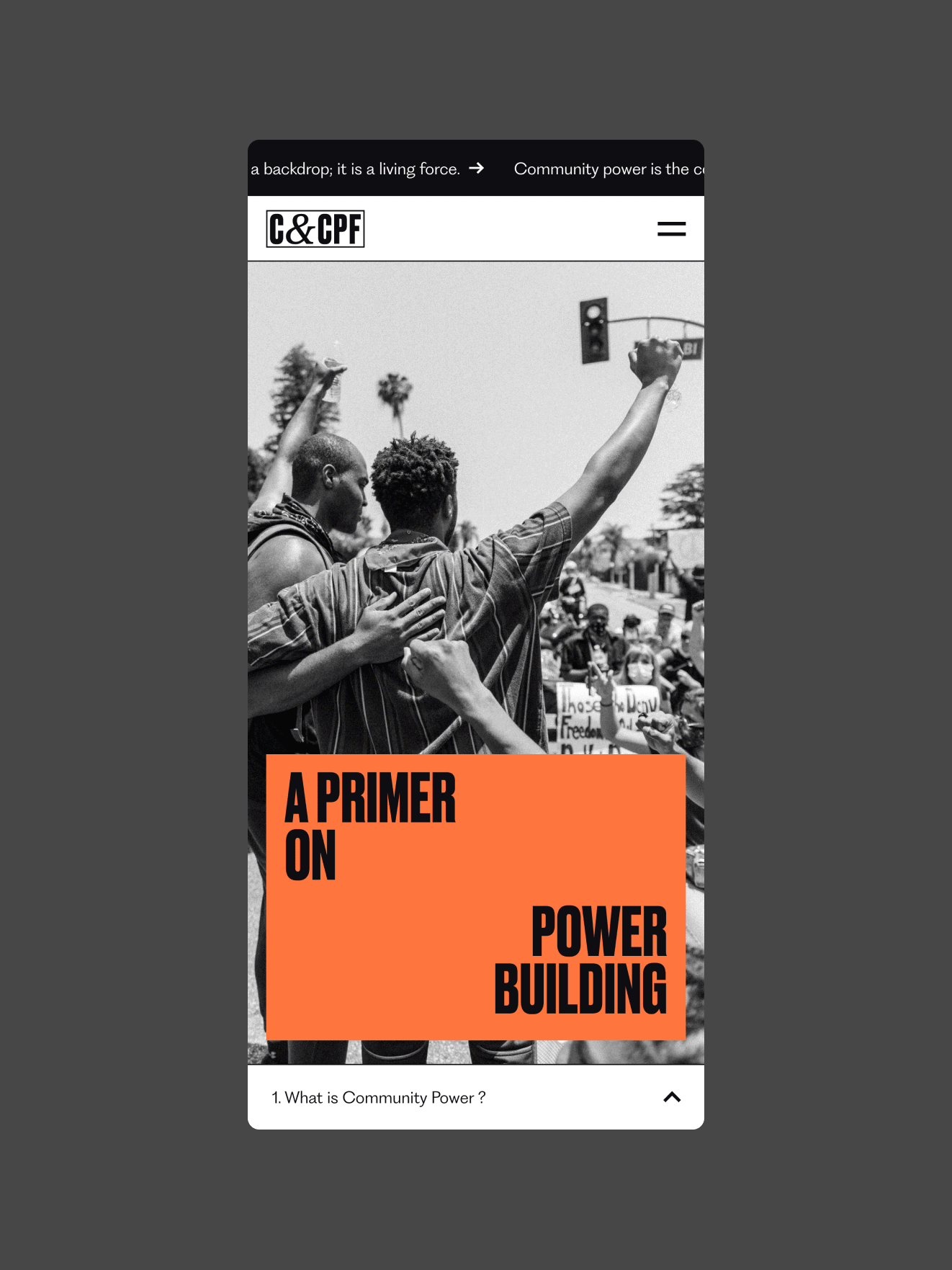
    Tech highlights

    WordPress
    Custom CMS image treatments
    Custom content library

    Defining power

    Although community power building is, in action, a longstanding practice, the lingo that goes along with the work may be new to some people.

    In providing copywriting and narrative support for this project, we wanted to help visitors develop a foundational understanding of how power works in society using accessible, clear language. On the “What is Community Power Building?” page, we break down some of the logistics of power building, as well as define relevant vocab, and provide context inherent to the work The Culture & Community Power Fund (C&CPF) does. From there, we guide readers toward more substantial references for further learning.
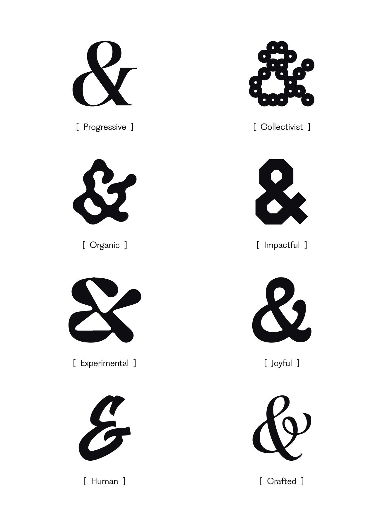
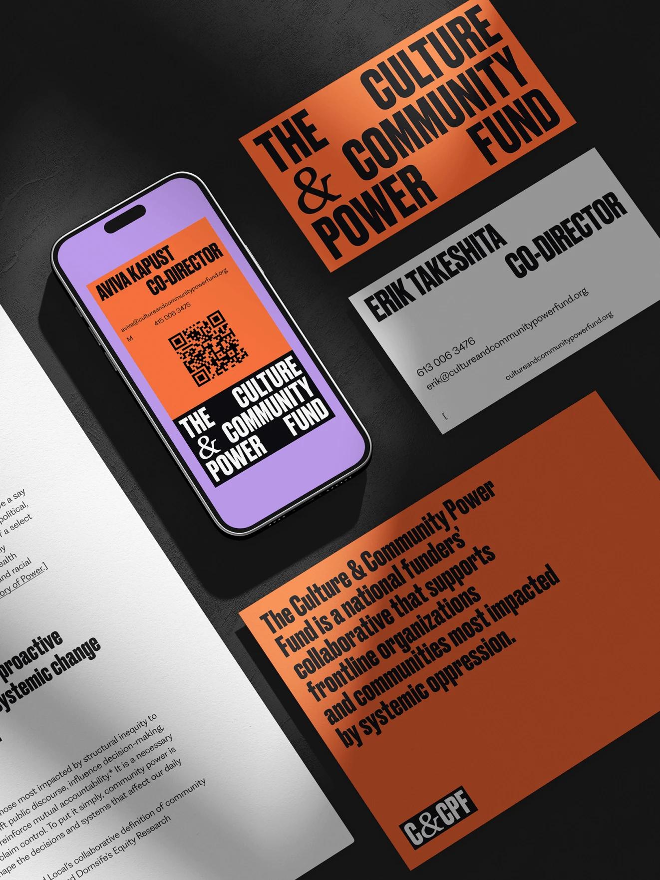
    Black text on an orange background reads Community power is not given, it is built.
    The top of a C&CPF page with a header that reads A primer on power building over a black and white image of a person with a fist raised in the air

    The ‘&’

    Collaboration is at the core of C&CPF. In creating the logo, we placed an emphasis on the ampersand (&) in the organization’s name as a nod to that ethos. We delivered the ampersand in various fonts to reflect the diverse visions of each of C&CPF’s partner-grantees.

    For example, the rounded font, Akaya Kanadaka, represents the joyful, celebratory aspect of culturally infused community power building. The groovy font, Pilowlava, represents C&CPF’s experimental funding approach, which remains flexible and adaptive to grantees’ needs, rather than requiring strict outcomes.

    Samples of the C&CPF branding on street posters. One reads Culture is more than a backdrop; it is a living force.
    The C&CPF logo, black lettering in a white square with a black border, against a bright orange background. The ampersand in the middle of the logo is changing fonts
    Variations of the ampersand in the organization's logo, some are more formal while others are funky
    Example content from the C&CPF website on a mustard yellow background. One piece of content reads Three dimensions of power organizational reflections: Worksheet
    The Culture & Community Power Fund logo on white text in a black rectangle, on a bright orange tote bag.
    Variations of the organization's new branding across mobile and on business cards. Cohesive design elements include bright orange, lilac purple, and bold black font.

    Gritty & bold

    The Fund was established in 2022. As a relatively new organization taking a fresh approach to trust-based philanthropy, C&CPF wanted to stay away from anything that made it look overly established. The site’s overall look and feel, including its collage-like design elements are gritty and bold, inspired by the graphic history of protest signs and zines. The animations used throughout the site are lo-fi and snappy, to complement the gritty vibe.

    The final color palette, a rich combination of orange, purple, yellow, black, and white, expresses warmth and invitation, since the Fund’s work is all about people and communities.

    C&CPF’s leadership wanted to make sure practitioners felt “deeply seen and heard” when visiting the new site. Photos and visual imagery on each page feature festivals in New Orleans, local football games in Memphis, and urban farms in Oakland, highlighting the people and culture at the center of the Fund’s work.

    Variations of the website on an iPad and iPhone. The iPad shows a bright yellow screen with an article displaying.
    The contact module on the new C&CPF site reads Connect with us in bold black lettering.
    An example article preview on the new site, which is a purple square with an image of people in white outfits and elaborate headdresses at a festival in New Orleans. The article headline reads Being and building beloved community: The intersection of culture and economy.

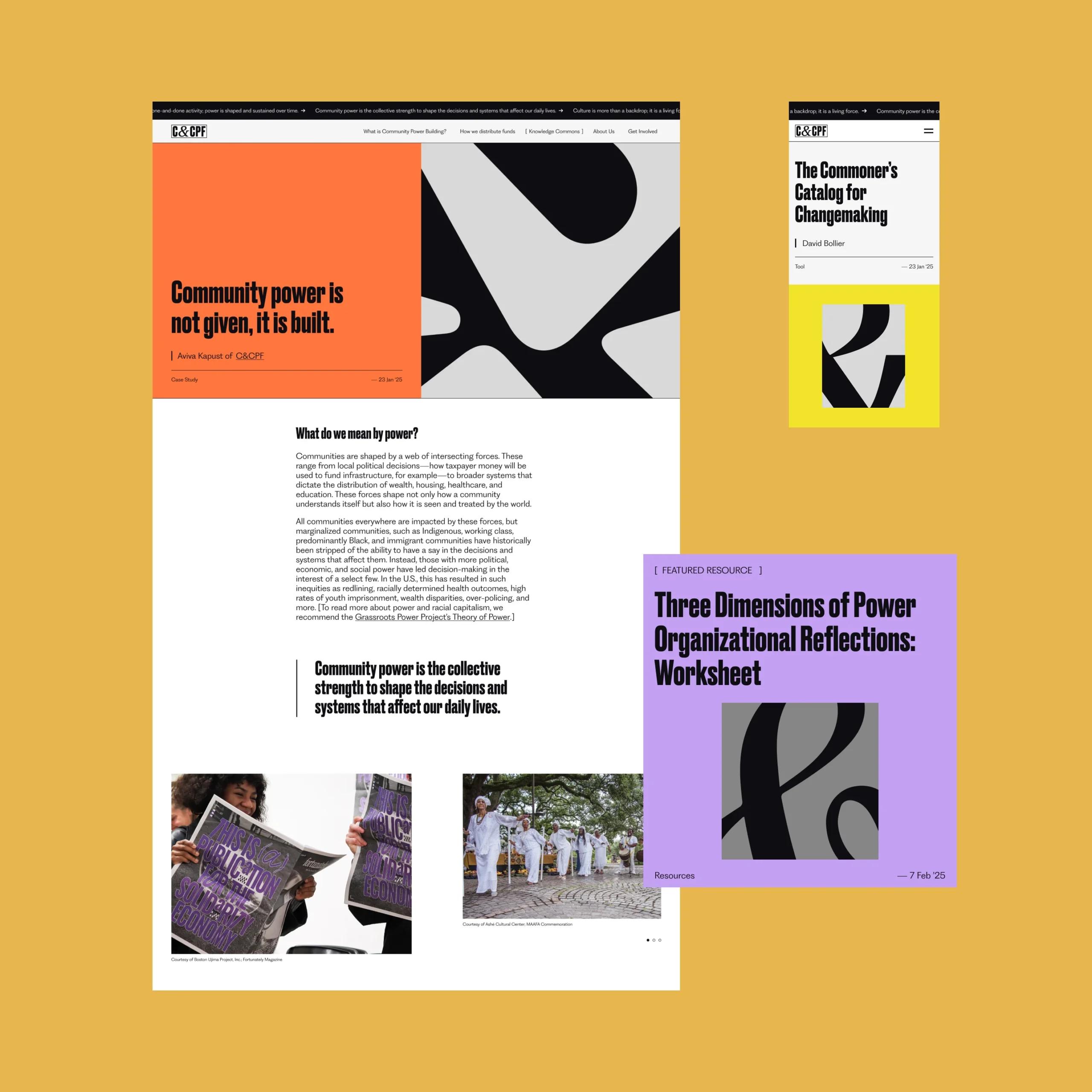
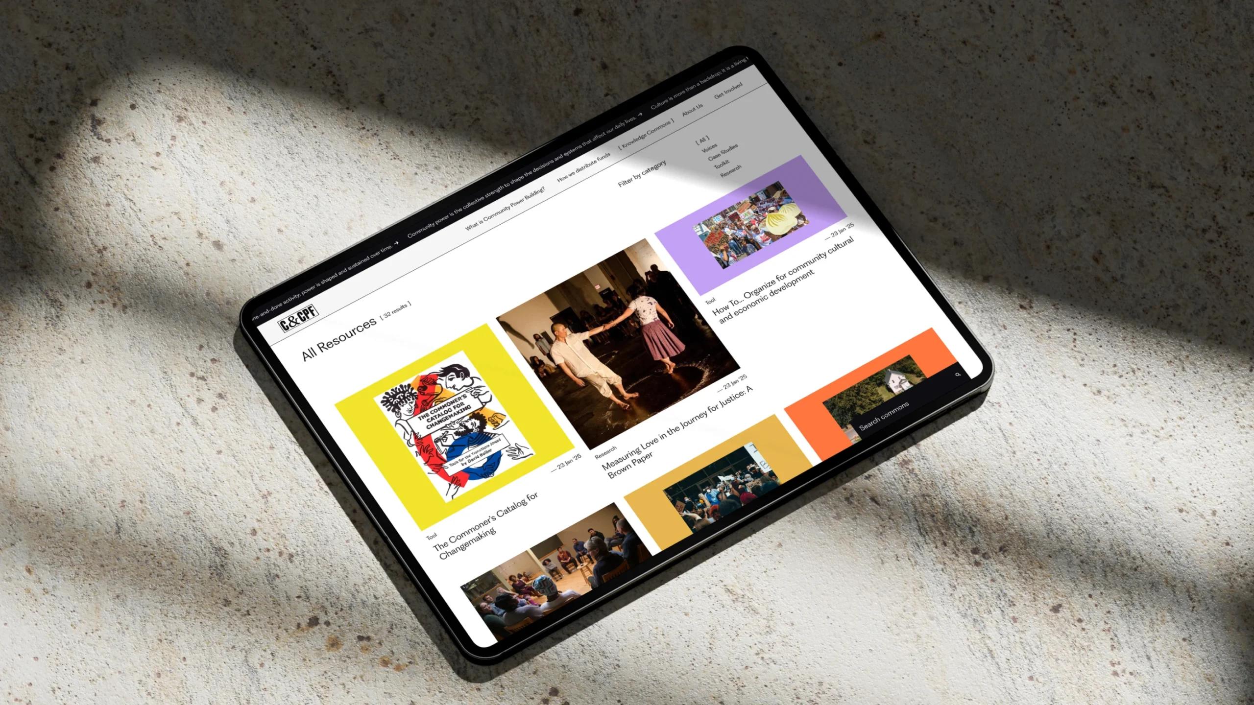
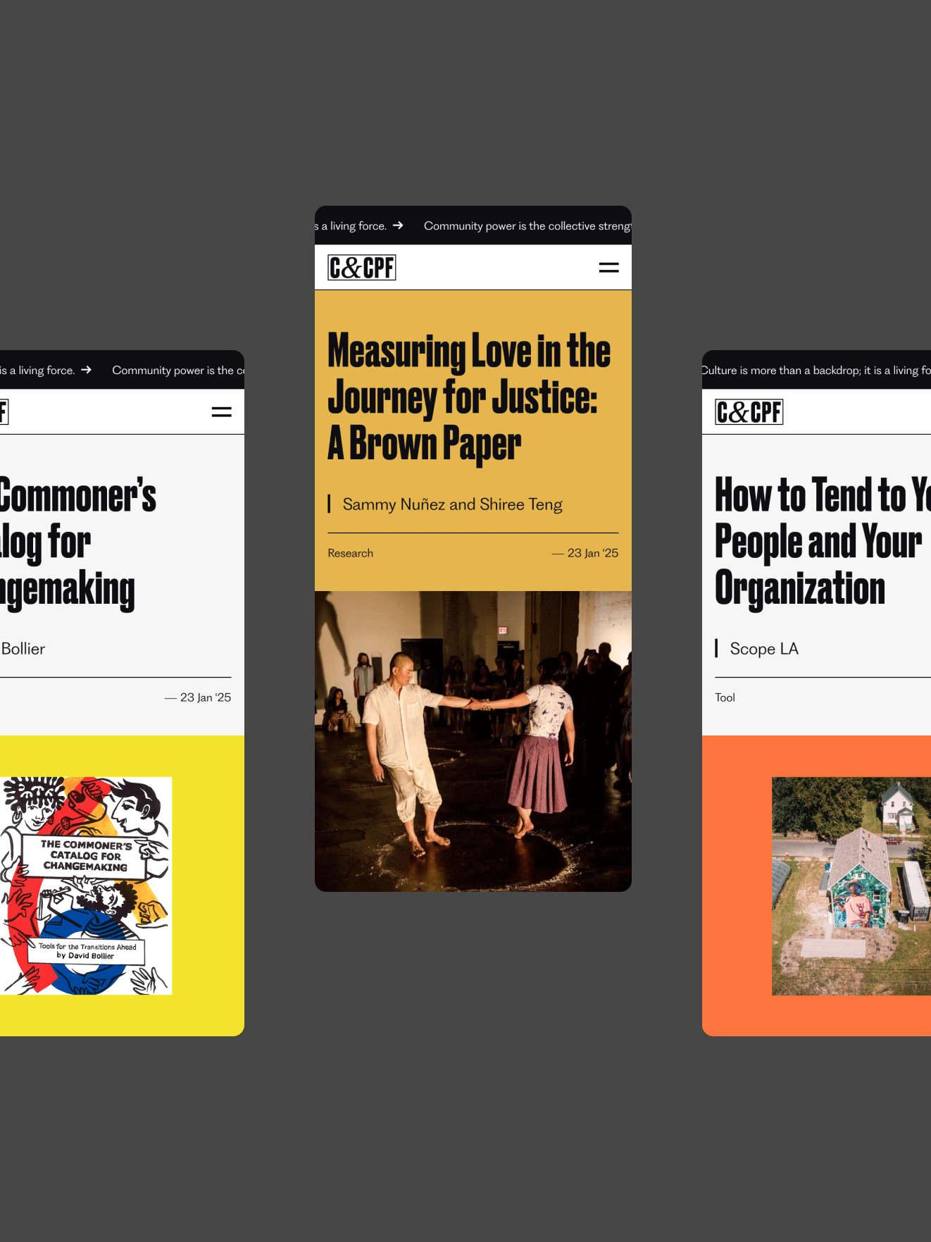
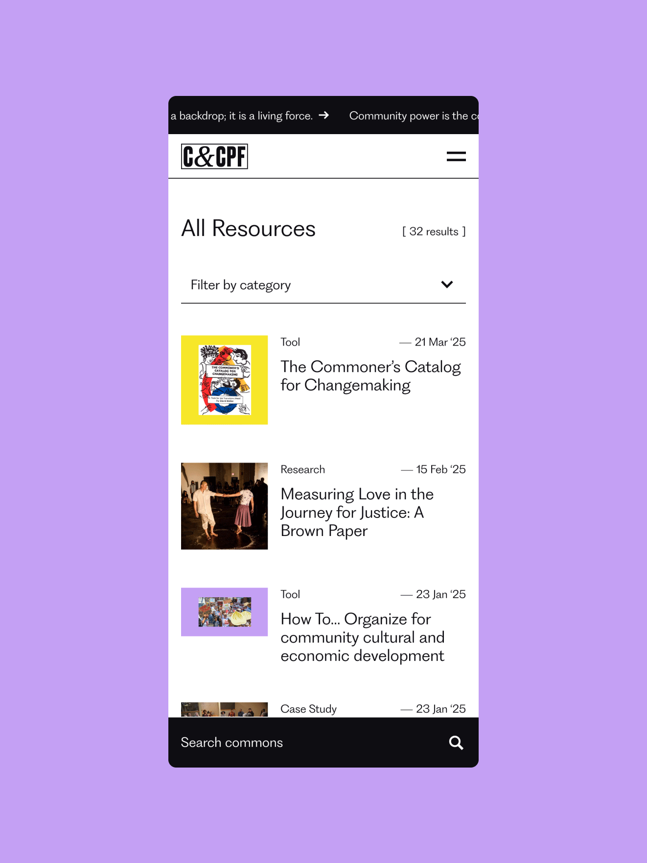
    Not-so-common knowledge in the Knowledge Commons

    One distinct aspect of the new C&CPF site is its resource library, which we custom-built so that visitors can submit content and admin can review and edit it.

    We created various content templates to account for articles, videos, photo essays, and audio elements. The hub hosts resources useful to those who are already working to build community power and want to see how others are approaching it, as well as those who are completely new to the space and want to learn more.

    The Knowledge Commons on an iPad, which appears as squares of article previews featuring the headlines and images on yellow, purple, and orange backgrounds
    More versions of the site on iPhone
    The All Resources page of the site features a list of articles with a search function

    Next up

    Please bear with us while we wrap our other case studies. In the meantime:
    Firefly Partners →
    Outside
    Revolutionizing tech strategies for social impact orgs with Firefly Partners →
    Mauj →
    Two iphones against a pink background showing the Mauj site. On one phone, an article on the screen reads "Debunking the Most Common (And Harmful) Myths about Self Pleasure." The other reads "Cycle" with an illustration of two nude women swimming toward each other to form a circle.
    Creating a shame-free resource hub on sexuality & menstruation for Arab women everywhere with Mauj →
    ×