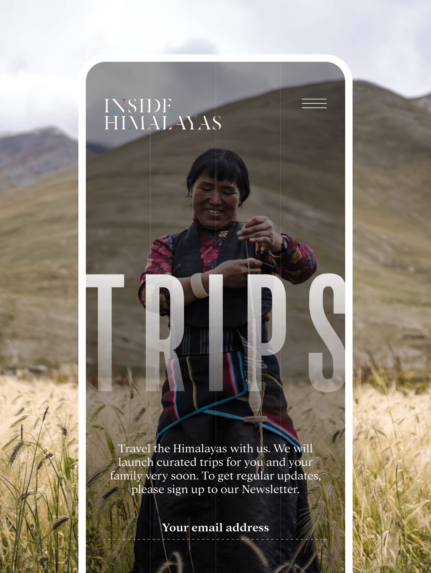
The client
Inside Himalayas is a leading resource for travelers and travel agents who care about sustainable and responsible experiences in and around Nepal.
Why this matters
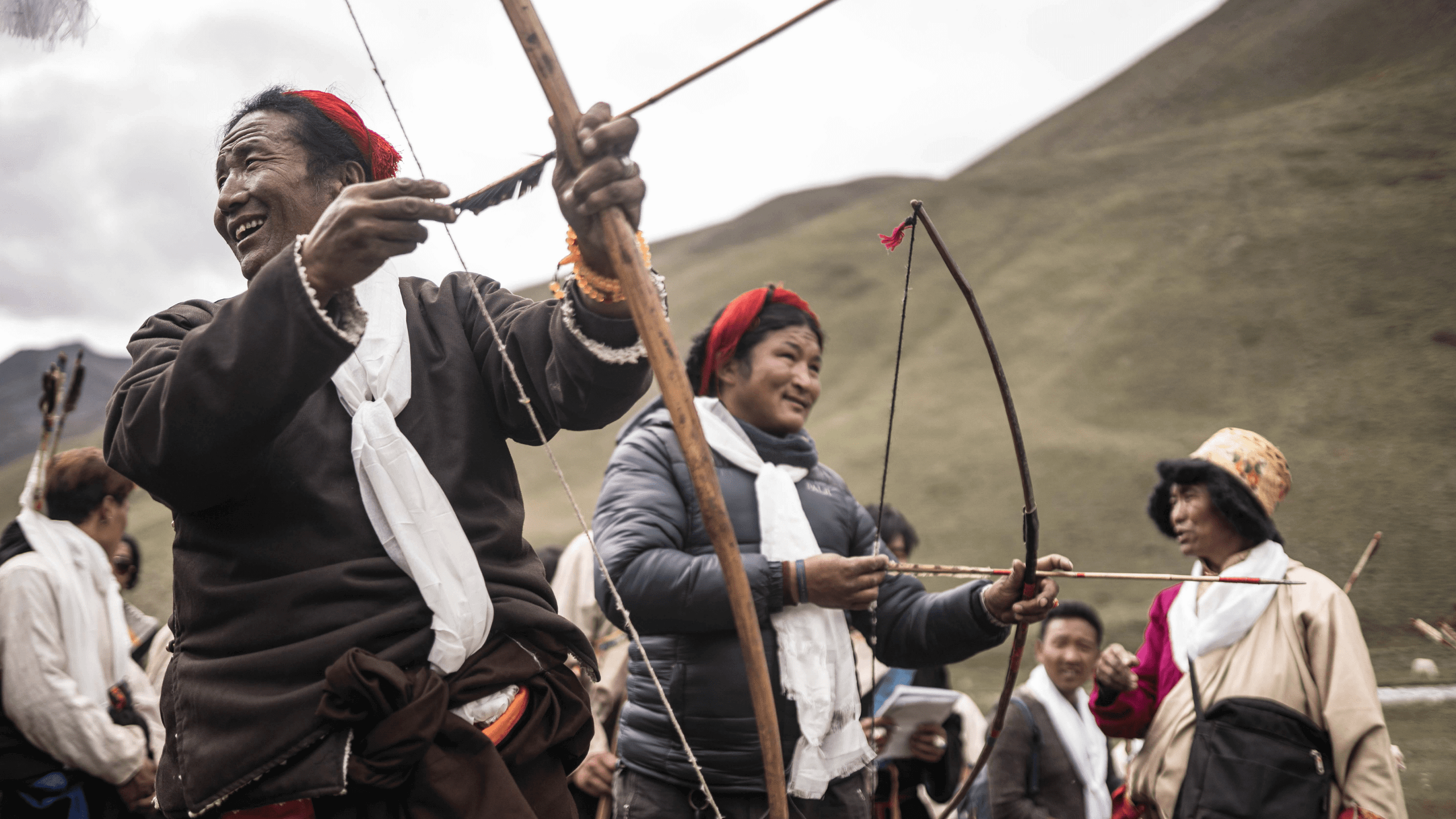
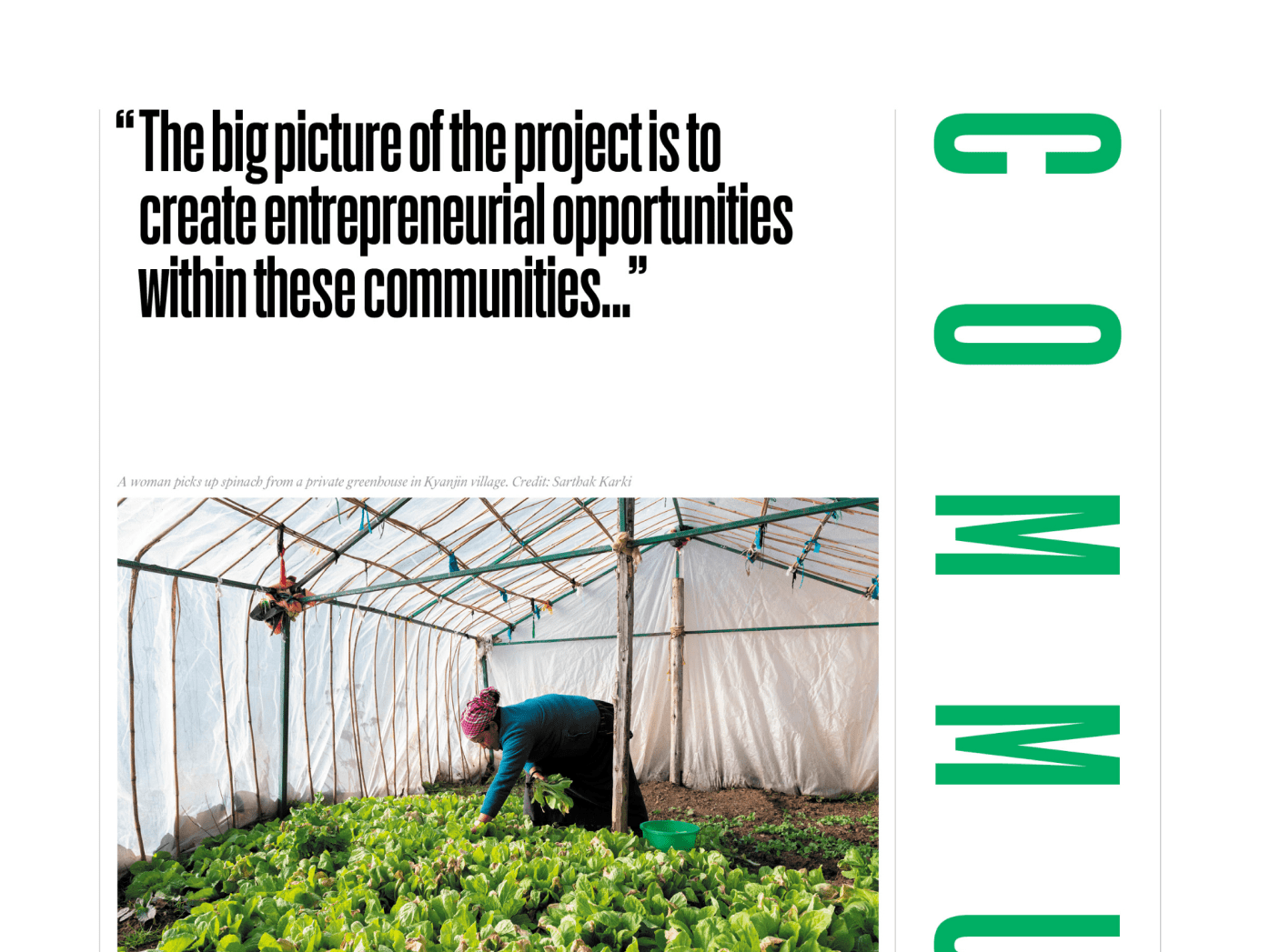
The Himalayan region is a premier tourist destination–but travel without consideration for the communities we’re visiting or the environment we’re landing in can be destructive. Inside Himalayas’ parent company, Royal Mountain Travel, promotes responsible engagement with the region we love.
The challenge
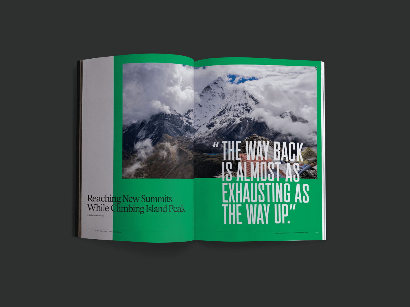
Capturing the essence of this richly historic, beautiful, and diverse part of the world in digital and print format.
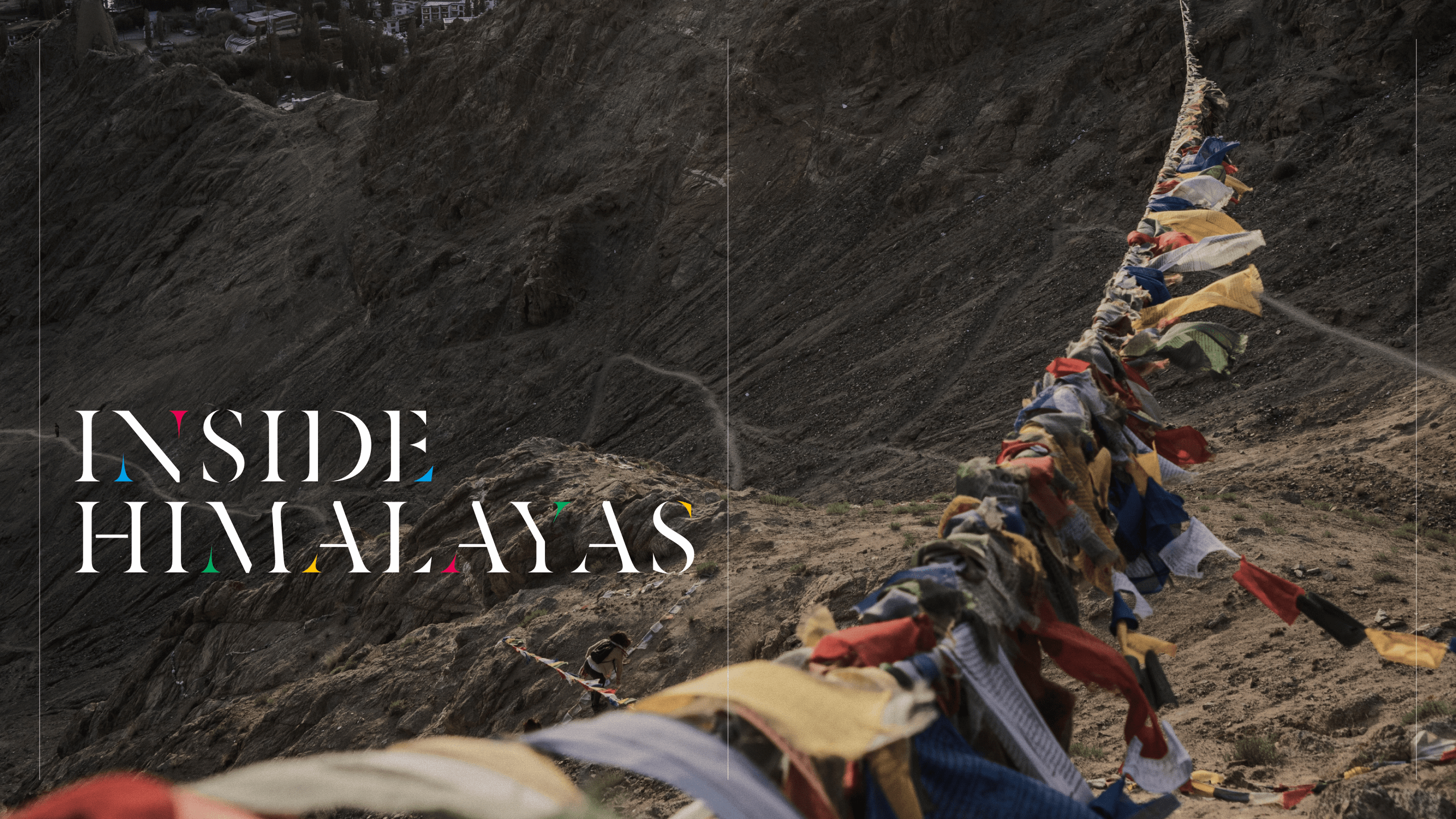
A symbolic logo
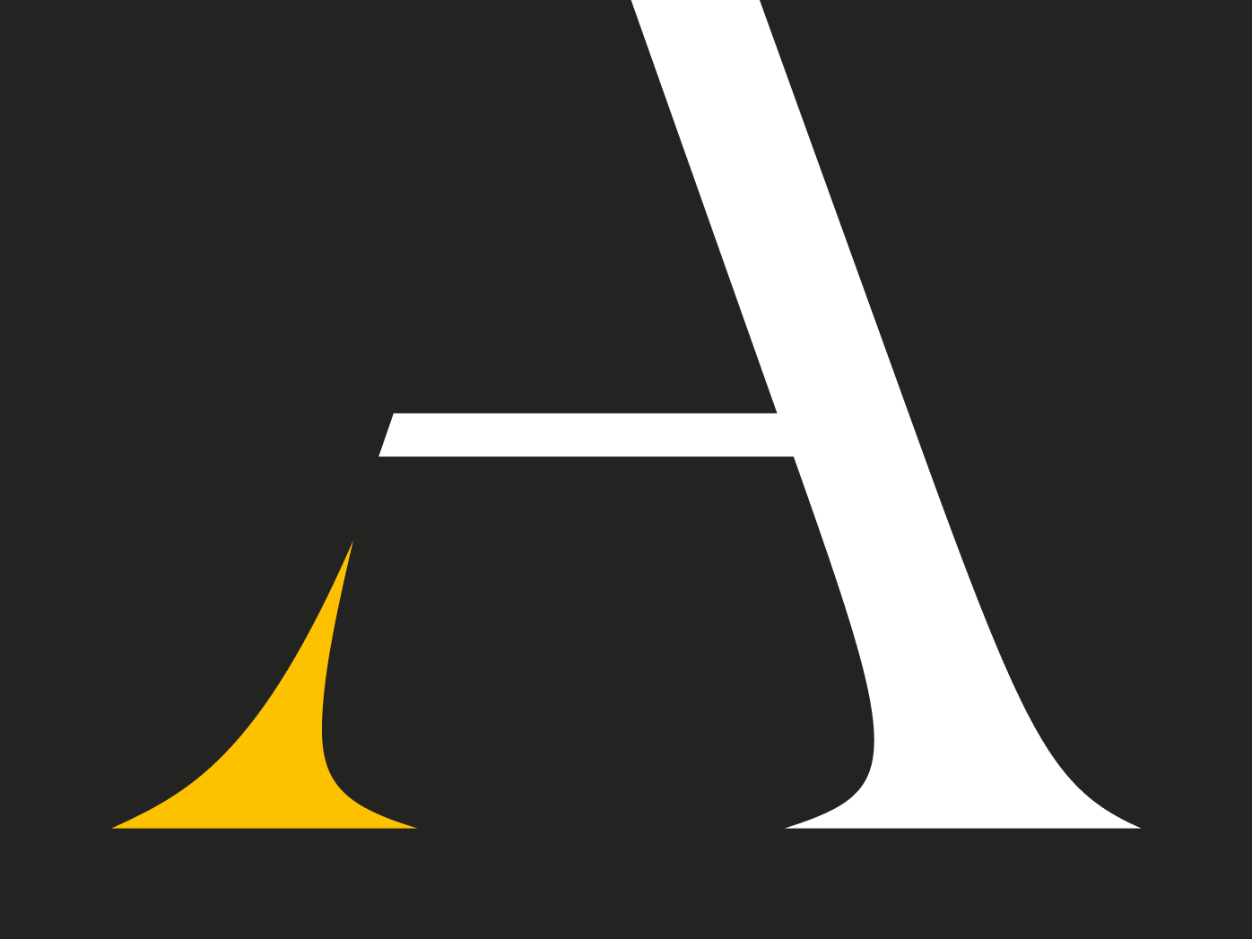
The Inside Himalayas visual identity is inspired by prayer flags, an important piece of symbolism. The colors of prayer flags represent each of the four elements, and are found throughout the mountains to bless all life and the surrounding land. We subtly incorporated the color and form into the logotype using a stencil serif font.
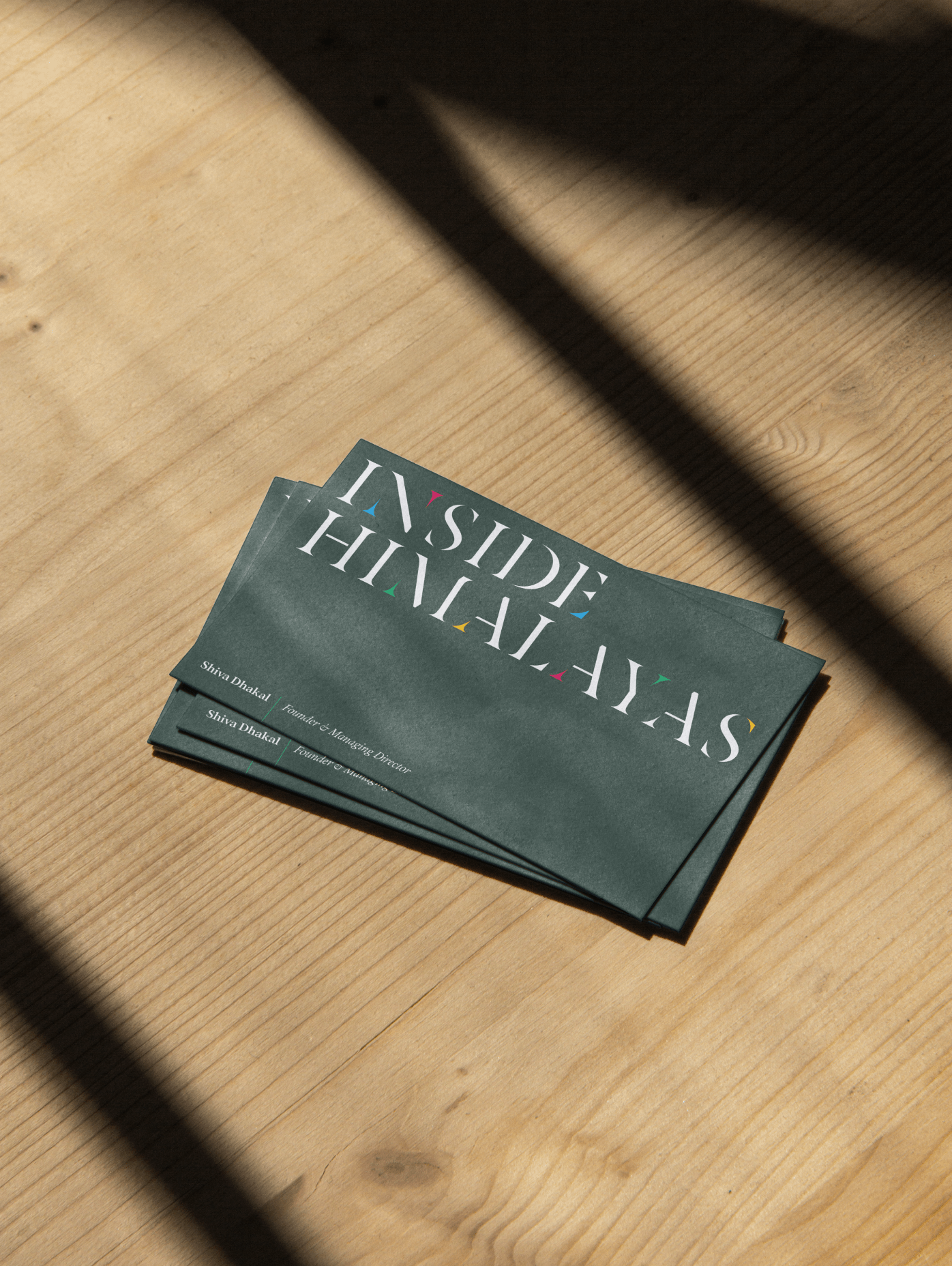
From digital to print (and back again)
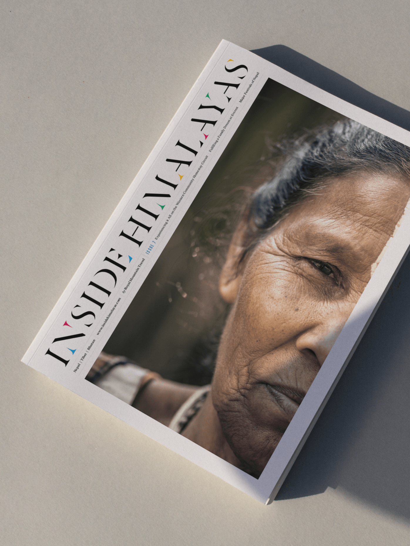
We further expanded the brand language through various print editions ranging from a full-length magazine to one-off special editions. Whether in-print or online, the design remains cohesive.
Maintaining audience trust online