Loading

    Skip to content

    Fork & Good

    Exploring the future of lab-grown meat through an agency collaboration.

    Site design | Site development
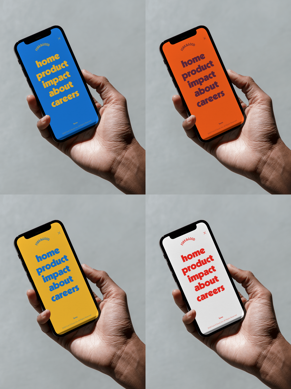
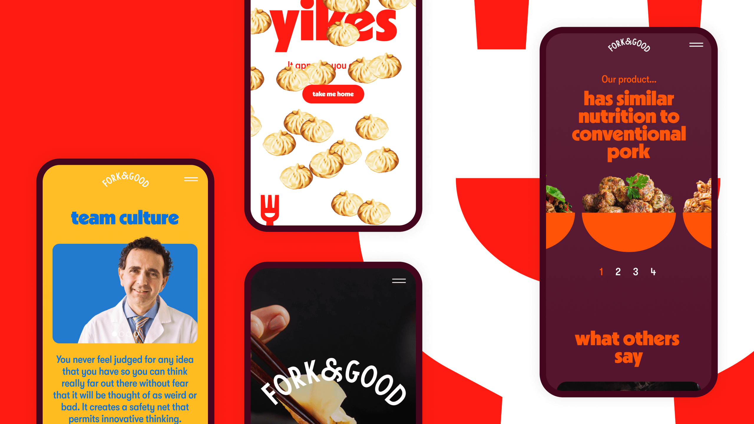
    Screenshots of the Fork & Good website
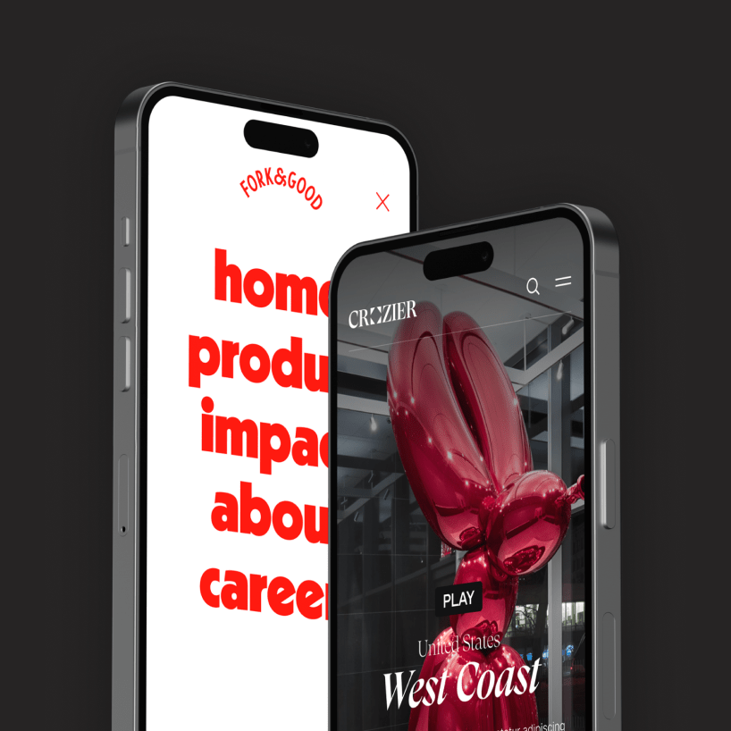
    Fork & Good Hero Image with App Screenshots

    Mother's role
    Mother created the initial branding for Fork & Good, including the logo, color palette, and typography.
    Outside's role
    Drawing inspiration from the branding Mother established, we designed a site & user experience to match the brand’s lively, funky feel and provide space for Fork & Good to explain its impact.

    The project

    In collaboration with the design agency Mother, we developed a playful, animated website to tell the story & science behind the lab-grown meat company Fork & Good.

    Why this matters:

    To sustainably feed more than 9 billion people by 2050, we need to produce 50 percent more food and decrease carbon emissions by two-thirds. Compared to industrial agriculture, Fork & Good’s production process uses 15 times less water & 70 percent less land, without the need for antibiotics.

    Tech highlights:

    • WordPress
    • Subtle animation and page transitions
    • Lottie integration

    Pigs can fly

    The Fork & Good logo is an expressive cartoon fork that bounces, laughs, and licks its lips. To walk users through the possibly unfamiliar concept of lab-grown meat, we used animation and transitions that make the experience interactive and approachable. Words bounce onto the page while photos glide smoothly across it. The fork, when hovered over, turns into a smiling contact button.
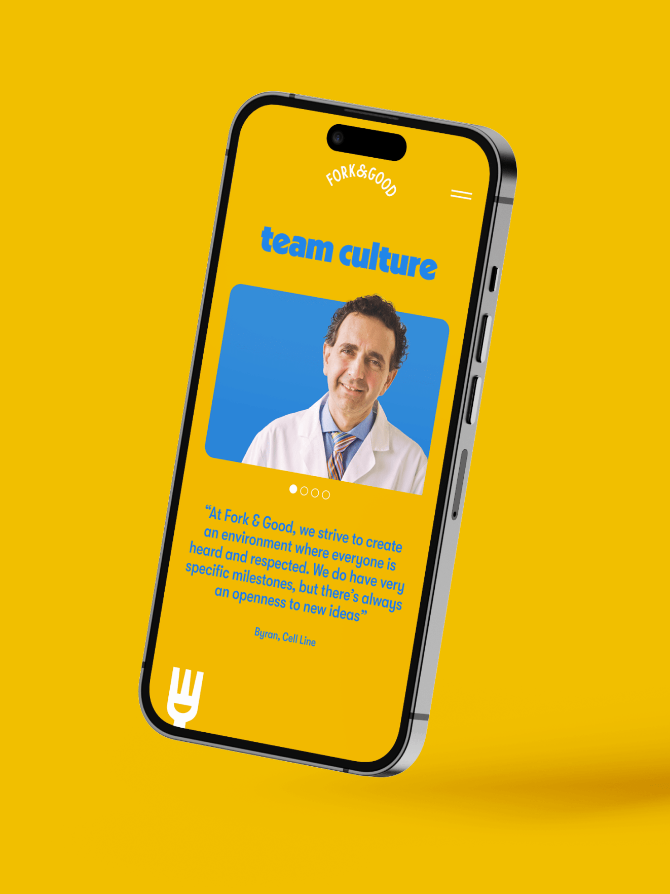
    App Screenshot for Fork & Good team module

    Dumpling-chic

    Mother created a playful brand using bold primary colors and a quirky font. We translated that look & feel into an equally stand-out digital experience, using a different color combination on each page, a color-changing navigation bar, and a 404 page full of raining dumplings.
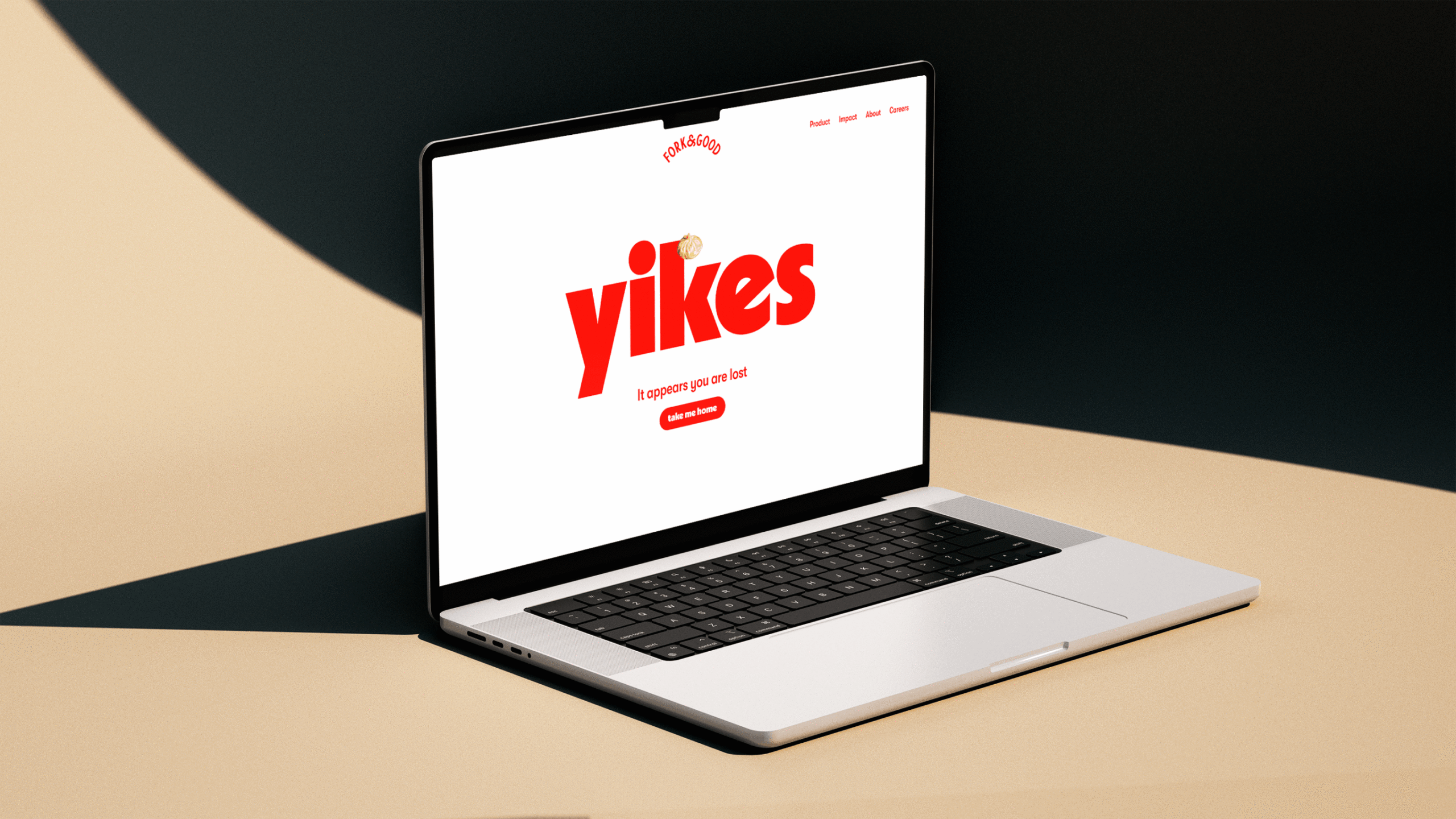
    Screenshot of Fork & Good 404 page
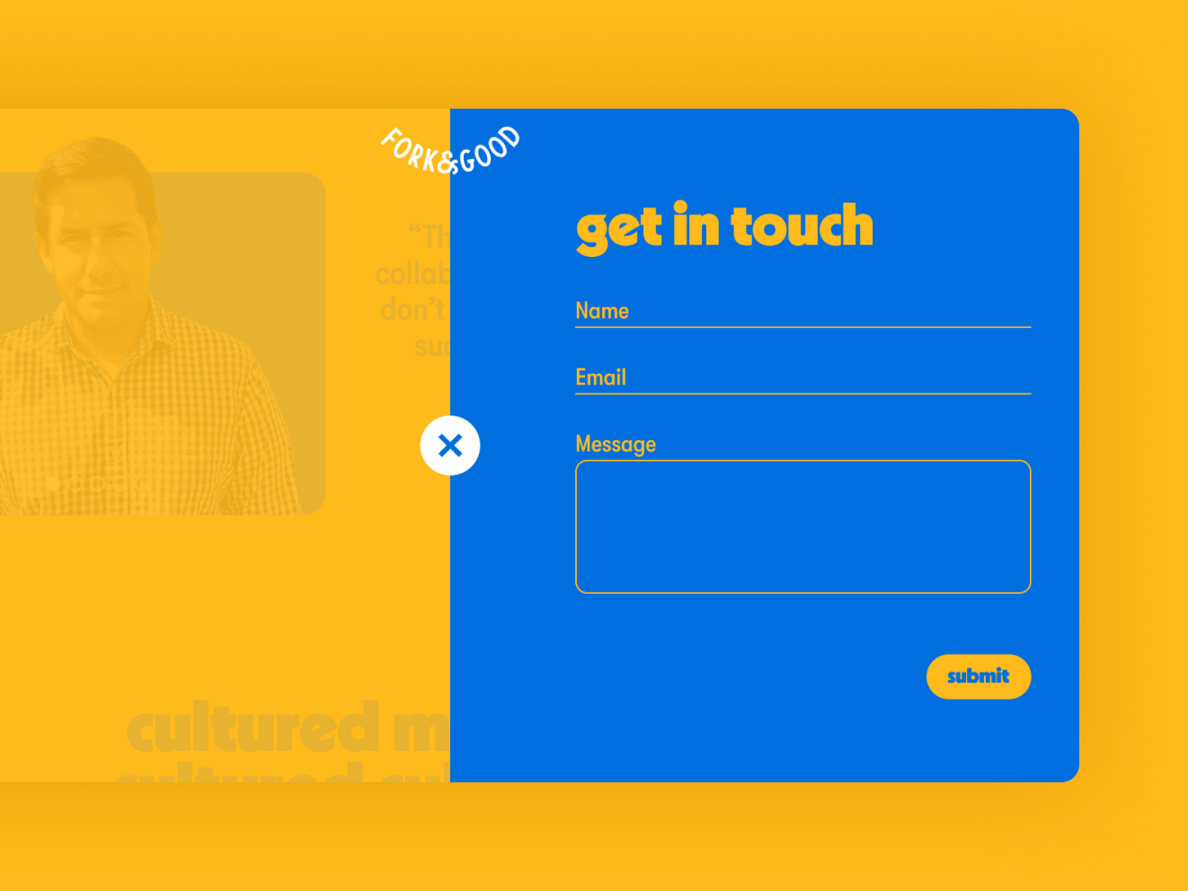
    Screenshot of Fork & Good contact form
    GIF of color changing navigation for Fork & Good

    Next Up

    More case studies to come. In the meantime:
    Nui →
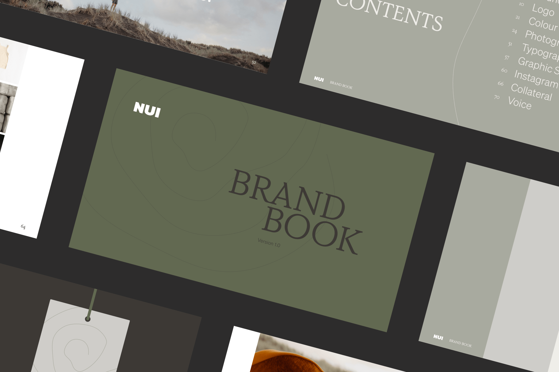
    Screenshot of Outsides project with Nui
    Returning to nature & natural materials to support sustainable fashion with Nui →
    Mauj →
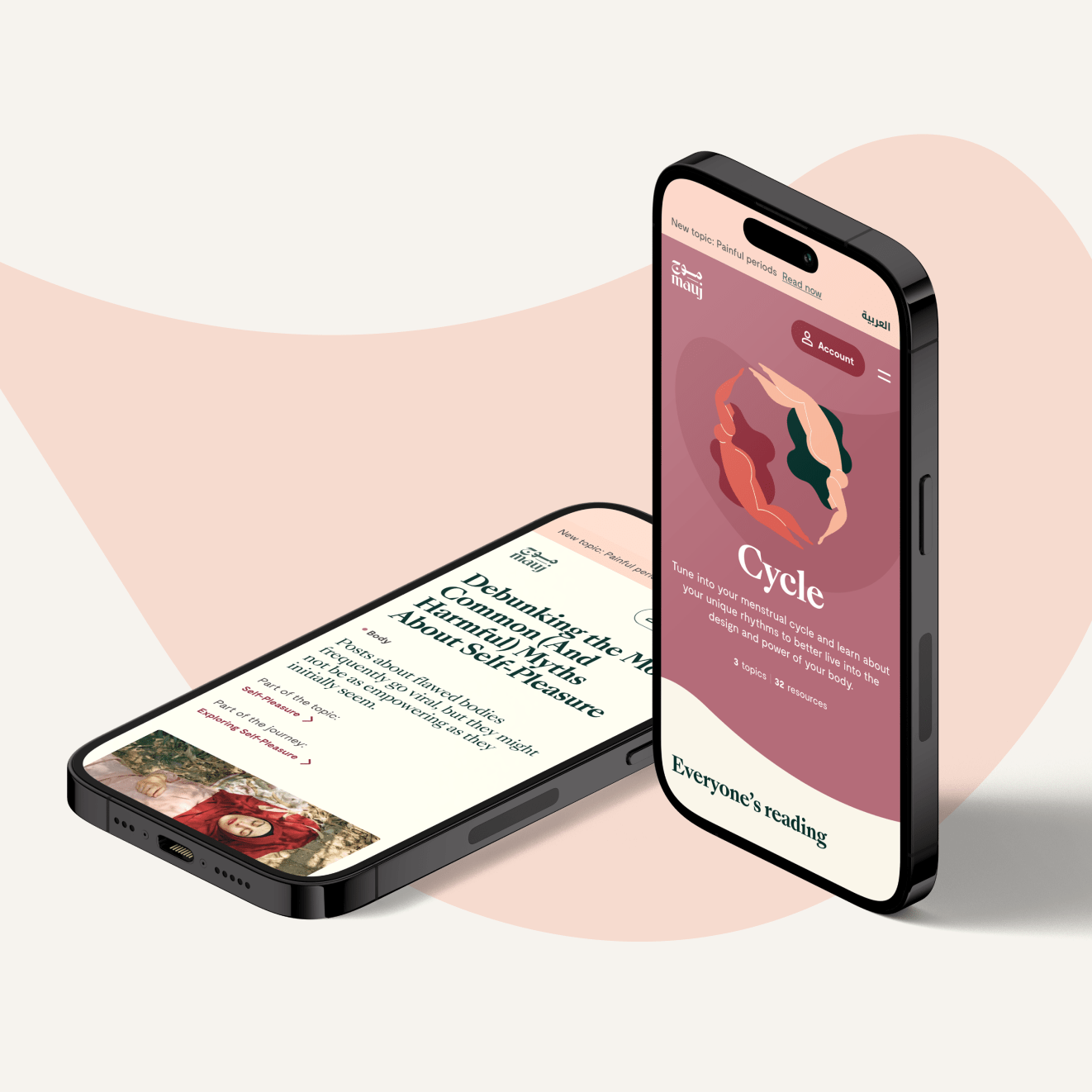
    Two iphones against a pink background showing the Mauj site. On one phone, an article on the screen reads "Debunking the Most Common (And Harmful) Myths about Self Pleasure." The other reads "Cycle" with an illustration of two nude women swimming toward each other to form a circle.
    Creating a shame-free resource hub on sexuality & menstruation for Arab women everywhere with Mauj →
    ×